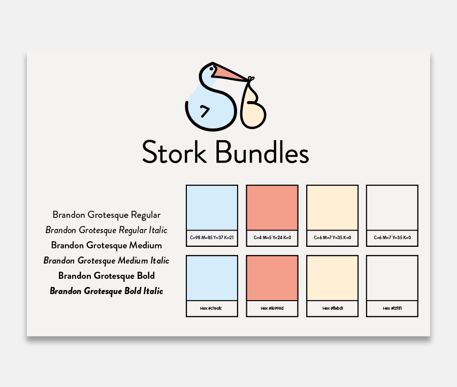
The Stork Bundles logo features a minimalist and charming design that represents a stork (S) carrying a bundle, which is traditionally associated with the delivery of babies. The stork is depicted with a simple yet effective line drawing, using soft colors: light blue for the stork’s body, a touch of pink for the beak, and a light peach color for the bundle (B).
Below the illustration, the brand name “Stork Bundles” is written in a clean, modern font, conveying a sense of simplicity and trust. The tagline “Delivering kind and conscious essentials” is placed beneath the brand name, suggesting a focus on thoughtful, responsible products. The overall design gives an impression of warmth, care, and reliability, perfectly suited for a brand focused on providing essentials for new parents.
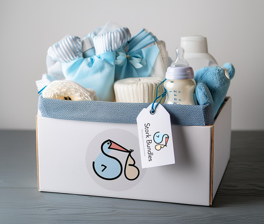
Thank you Jacqui, we love what you've done with our logo. Your creative and clever thinking has allowed us to put our best foot forward for the launch of our business.